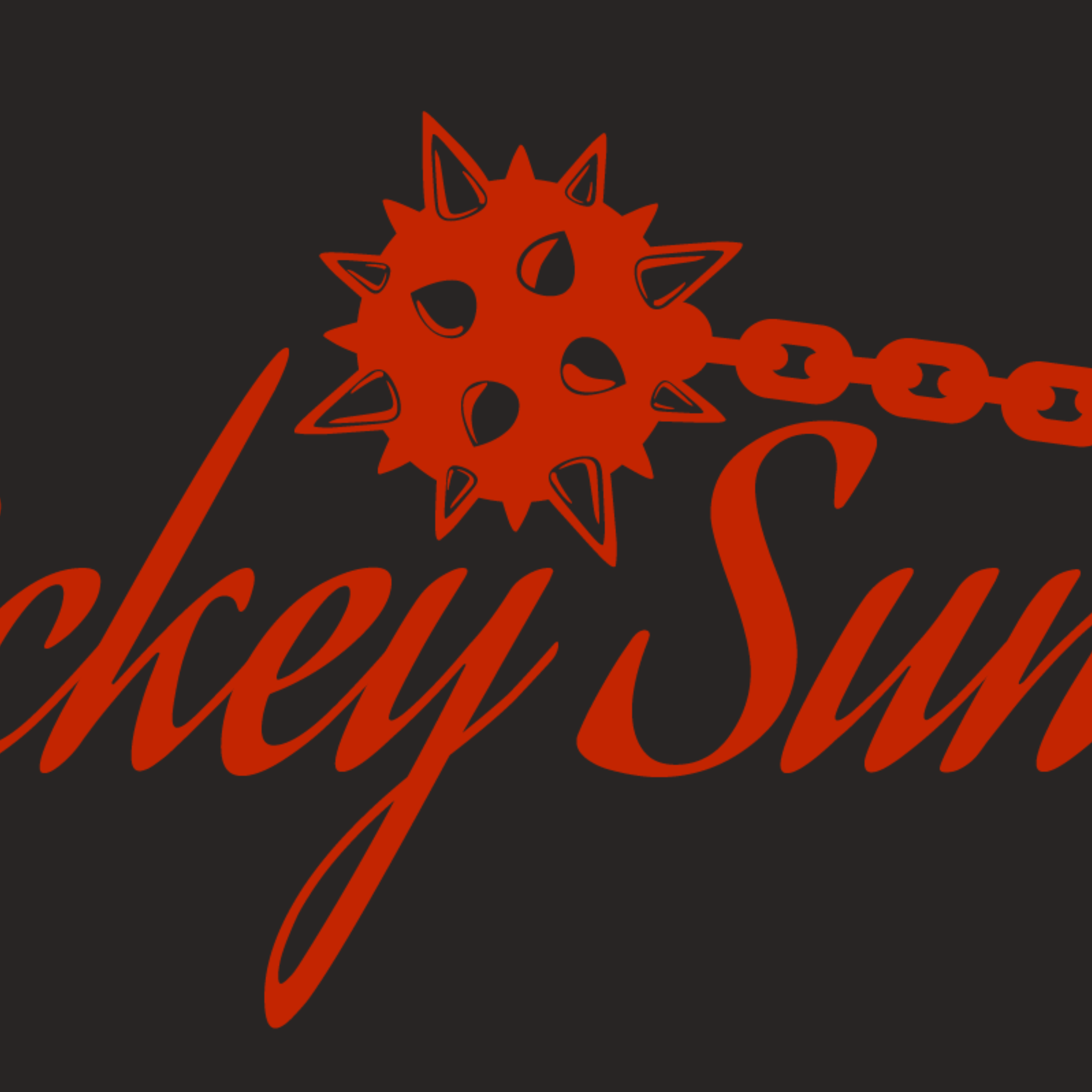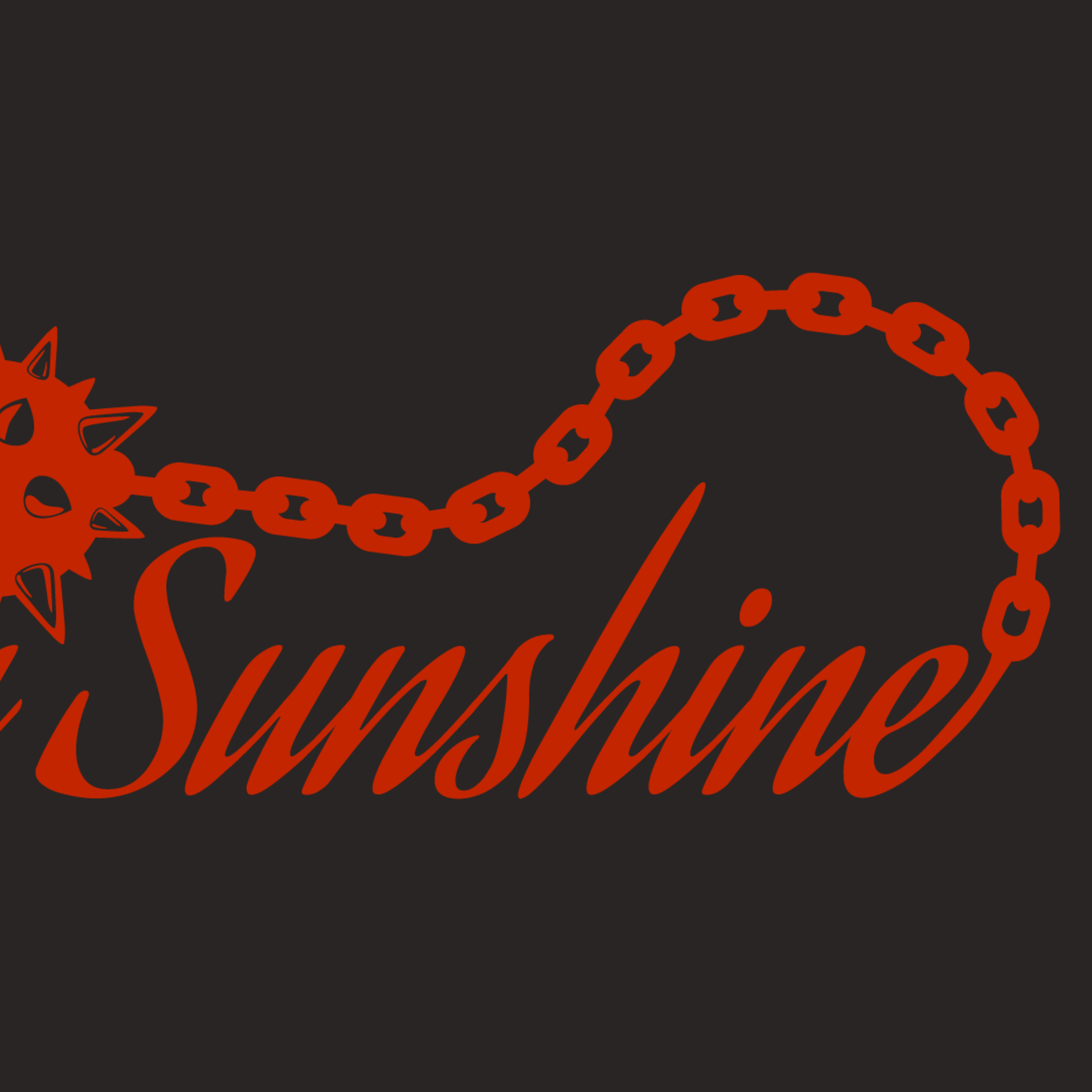
Mickey Sunshine
Mickey Sunshine came to me with a vision that blended grit and glow (creepy suns, barbed wire hearts, and locket motifs) all tied together with bold, timeless typography. They wanted something simple enough to print on anything, but strong enough to stick as the long-term face of their brand. I delivered multiple logo options that pulled from their references, from movie-poster script to folk-inspired fonts, and refined the design into a mark that channels their Mannequin Pussy–inspired aesthetic while still feeling distinctly their own.
The final logo balances edge and catchiness, giving Mickey Sunshine a visual identity that’s versatile, memorable, and built to last.
Logo Design & Development
Typography Exploration
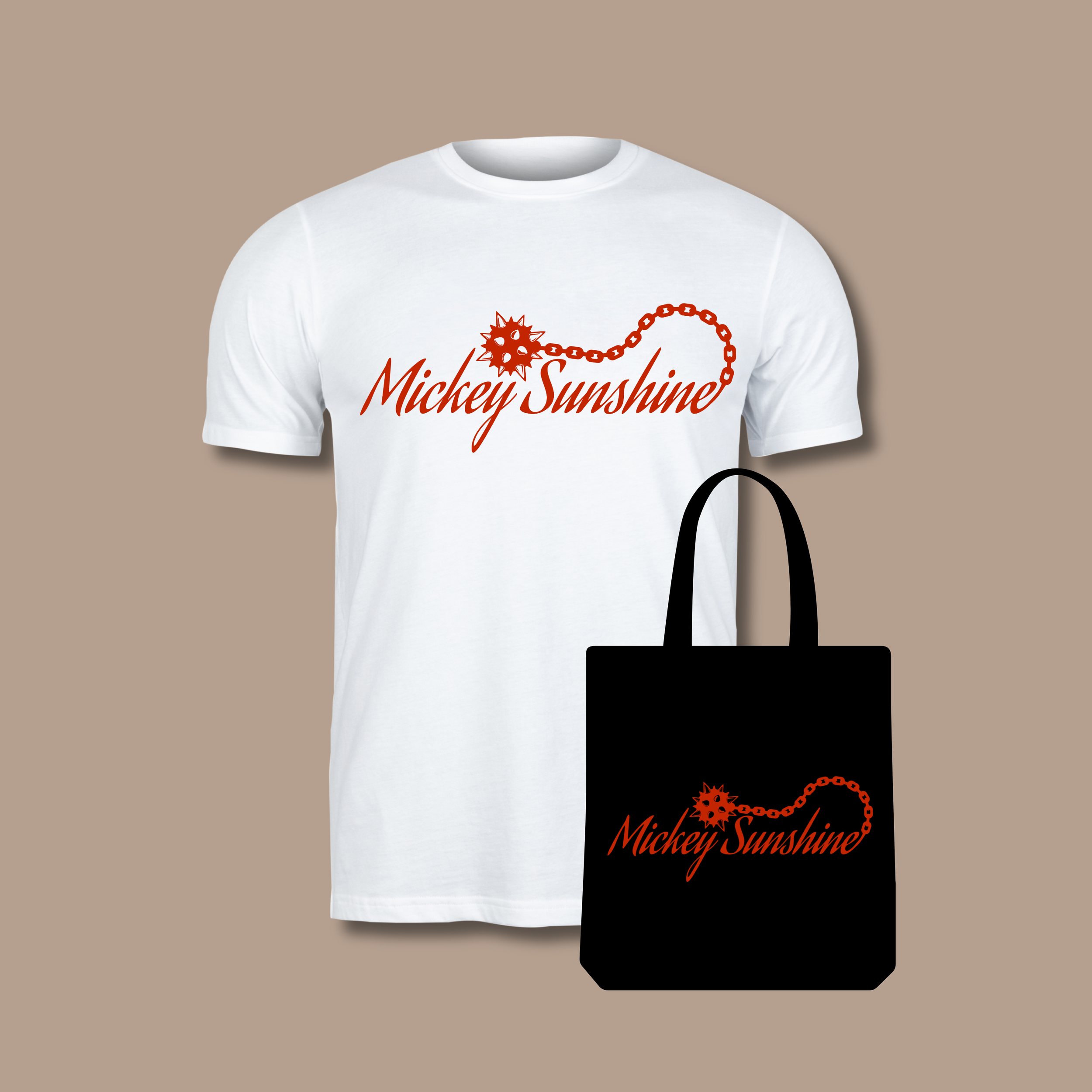
Web & Print Ready file-prep